
Complicated truth about European economic stagnation and living standards
European decline is real, but both sides over/under-state its magnitude; also some notes on US vs Europe living standards comparisons


Over the last couple of years, a growing consensus has formed among economic commentators and policymakers that the European economy is falling significantly behind the American one. The culmination point was probably the release of the Draghi report in 2024, which painted a sobering picture of European competitiveness and productivity, and landed with considerable force precisely because it came from inside the European establishment.
The first serious challenge to that narrative came in December, when Gabriel Zucman published a thread and an article challenging several of the productivity and living-standards comparisons behind the consensus view. The thread generated some discussion at the time, but remained mostly within relatively small economic social-media circles. Then, earlier this month, Paul Krugman waded into the debate with a post arguing that the conventional narrative of European decline is mostly wrong. In follow-up posts, he developed the argument further, drawing significant attention and responses from a number of economists — most notably Pieter and Luis Garicano of the Silicon Continent blog, who pushed back on Krugman’s analysis and defended the view that Europe is genuinely falling behind.
Their disagreement touches on important conceptual and methodological questions that are worth taking seriously. International economic comparisons are tricky, and easy to get wrong. In my view, both Krugman and the Garicanos get some things right, but both also overstate parts of their case.
EU-US economic comparisons come back every now and then, and people tend to sort themselves into one of two camps — Euro-bashing or America-bashing. In this case, the truth is more complicated than either camp suggests, so it is worth clearing up the topic a bit.
How to measure economic growth?
The central disagreement between the Garicanos and Krugman is about which measure of productivity and economic growth you should use when making international comparisons. Krugman favors measuring GDP using current-price PPP. Pieter and Luis argue that this is the wrong tool for comparing productivity growth across countries over time, and that it systematically understates European economic stagnation. They prefer instead using constant-price PPP measure. Since this methodological dispute is the crucial wedge between the two camps and drives most of the difference in their conclusions, I want to explain it in some depth.
PPP adjustments, current vs constant prices and chain-linked measures
PPP, or purchasing power parity, is the tool economists use to compare economies across countries while controlling for differences in price levels. The basic idea is straightforward — if you want to compare income, output, or living standards in, say, 2023, simply converting currencies at market exchange rates is not enough, because the same amount of money buys different quantities of goods and services in different countries. So economists compare the prices of broadly similar baskets of goods and services and use those comparisons to adjust GDP per capita, consumption, or productivity figures. PPP does not perfectly measure welfare or household living standards, but it gives a much better sense than market exchange rates of how much real domestic purchasing power income represents.
The problem becomes harder when we move from comparing countries at a single point in time to comparing their performance over many years. The basket of goods and services changes, relative prices move differently across countries, and the structure of production itself evolves. A country may become more productive in software, pharmaceuticals, advanced manufacturing, or business services, while another may grow more in construction, hospitality, public services, or domestic consumption. Since prices in these sectors do not move in the same way, especially when some are tradable and others are local services, the choice of price adjustment becomes central.
One approach, adopted and advocated by Krugman, is to compare countries using current PPP figures year by year. This means that the PPP conversion factor is updated each year to reflect that year’s relative price levels. In that sense, current PPP is very useful for asking a cross-sectional question: how much purchasing power does GDP per capita or GDP per hour represent in each country in a given year? If US prices rise relative to European prices, current PPP reflects that. It tells us that a dollar of income in a high-price economy buys less domestic consumption than the same nominal amount would suggest.
But this is not the same as measuring real growth over time. Current PPP adjusts for price differences between countries in a given year, but it does not cleanly deflate output within a country across time. If you compare current-PPP GDP in 2000 with current-PPP GDP in 2023, the change reflects not only real output growth, but also inflation, changes in relative prices, shifts in the PPP basket, and revisions to PPP benchmarks. In other words, current PPP gives you a sequence of useful yearly snapshots, but the movement between those snapshots is not a pure measure of real growth.
This is the crucial distinction: PPP is a spatial price adjustment, while real GDP growth requires a temporal price adjustment. Current PPP answers, “How do these countries compare at today’s prices?” It does not cleanly answer, “How much more real output does this country produce than it did twenty years ago?” For that question, economists usually use constant-price or chain-linked volume measures from national accounts.
The alternative approach, advocated by Pieter and Luis Garicano, is to use constant PPP or real GDP measures based on national deflators. Here the comparison starts from a base-year PPP level, and then each country’s output is extrapolated using its own real growth rates. This preserves the internal real-growth logic of national accounts: if the US statistical office says US real GDP per hour grew faster than German real GDP per hour, the constant-PPP comparison reflects that. This is better suited for questions about productive capacity, productivity growth, and long-run economic dynamism.
However, constant PPP also has weaknesses. It fixes the international price structure at a base year, so if relative prices change substantially over time, the base-year PPP becomes less representative. For example, if US healthcare, housing, education, and personal services become much more expensive relative to Europe, a constant-PPP comparison may not fully capture how current purchasing power differs between the two economies. There is also a second problem: constant-PPP comparisons rely on each country’s own national accounts deflators to extrapolate real growth from the base year. But national statistical offices do not always measure inflation, quality changes, public services, software, healthcare, housing, or digital output in exactly the same way. As a result, some of the measured gap in real growth may reflect differences in statistical methodology, not only genuine differences in economic performance. So constant PPP is better for real-growth comparisons than current PPP, but it is not perfect: it can become less representative as relative prices change, and it inherits inconsistencies from national deflators.
This is why chain-linked PPP measures are important, though they are not a perfect solution either. They try to avoid both extremes. Instead of freezing the price comparison permanently in one base year, or simply comparing current-PPP snapshots that are not clean real-growth measures, chained PPP links together comparisons over time using updated price structures. In simple terms, it compares one period to the next using prices close to that period, then chains those comparisons into a longer series. This is the logic behind variables such as Penn World Table’s chained PPP measures. They are designed to be more suitable for comparing economies across both countries and time than either pure current PPP or a single-base-year constant PPP.
But chained PPP measures also come with costs. They are more complex, less transparent, and more sensitive to index-number choices than a simple constant-PPP extrapolation. Because they update the international price structure over time, changes in the series can reflect not only national real growth, but also the way changing relative prices are incorporated into the chain. That is not necessarily wrong, but it means the interpretation is less straightforward. Constant PPP gives a cleaner “fixed ruler” growth comparison from one benchmark year, while chained PPP gives a more flexible but more methodologically involved comparison across countries and time.
Even here, the exact variable matters. If the question is living standards, an expenditure-side measure is usually more relevant, because it focuses on what households and economies can consume or absorb. If the question is productivity or productive capacity, an output-side measure is more relevant, because it focuses on what the domestic economy produces. This distinction matters in the US-Europe debate. A measure of current purchasing power may show Europe doing relatively well compared with the US, while a measure of output-side productivity growth may show a clearer US lead.
The disagreement is therefore not simply about which PPP adjustment is “right” or “wrong.” It is about what question the measure is answering. Current PPP is useful if we want to know how far income goes in each country at today’s prices. Constant PPP is useful if we want a transparent growth comparison anchored to one benchmark year and extrapolated using national real growth rates. Chain-linked PPP is useful if we want a broader cross-country-over-time comparison that updates price structures, but it is not immune to methodological choices or interpretive ambiguity. The mistake is to treat any one measure as if it answered all of these questions at once.
Applying it to Europe vs US
In his post “Is Europe in Economic Decline?” Paul Krugman shows this graph using current PPP per capita GDP.
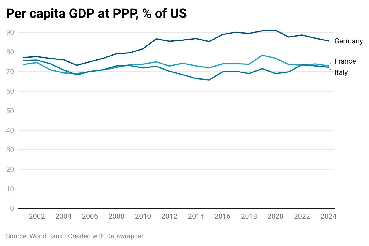
As I mentioned before, there are a lot of problems with using current PPP for making cross-country comparisons over time. This measure is not really suitable for temporal comparisons in the first place. But beyond that, there are also more specific problems with using it to compare productivity growth between the US and Western Europe.
As Luis and Pieter pointed out, metrics based on current prices miss productivity gains in sectors where prices are falling. If a country’s output doubles, but the price of that output is cut in half, current PPP measures fail to fully capture the increase in real productive capacity. Much of American growth in the 21st century has been concentrated in the tech sector, where rapid productivity gains led to significant price declines. That is why they argue that constant PPP is a more appropriate measure, since it captures gains in real output growth more accurately. To illustrate this point, they present the following graph.
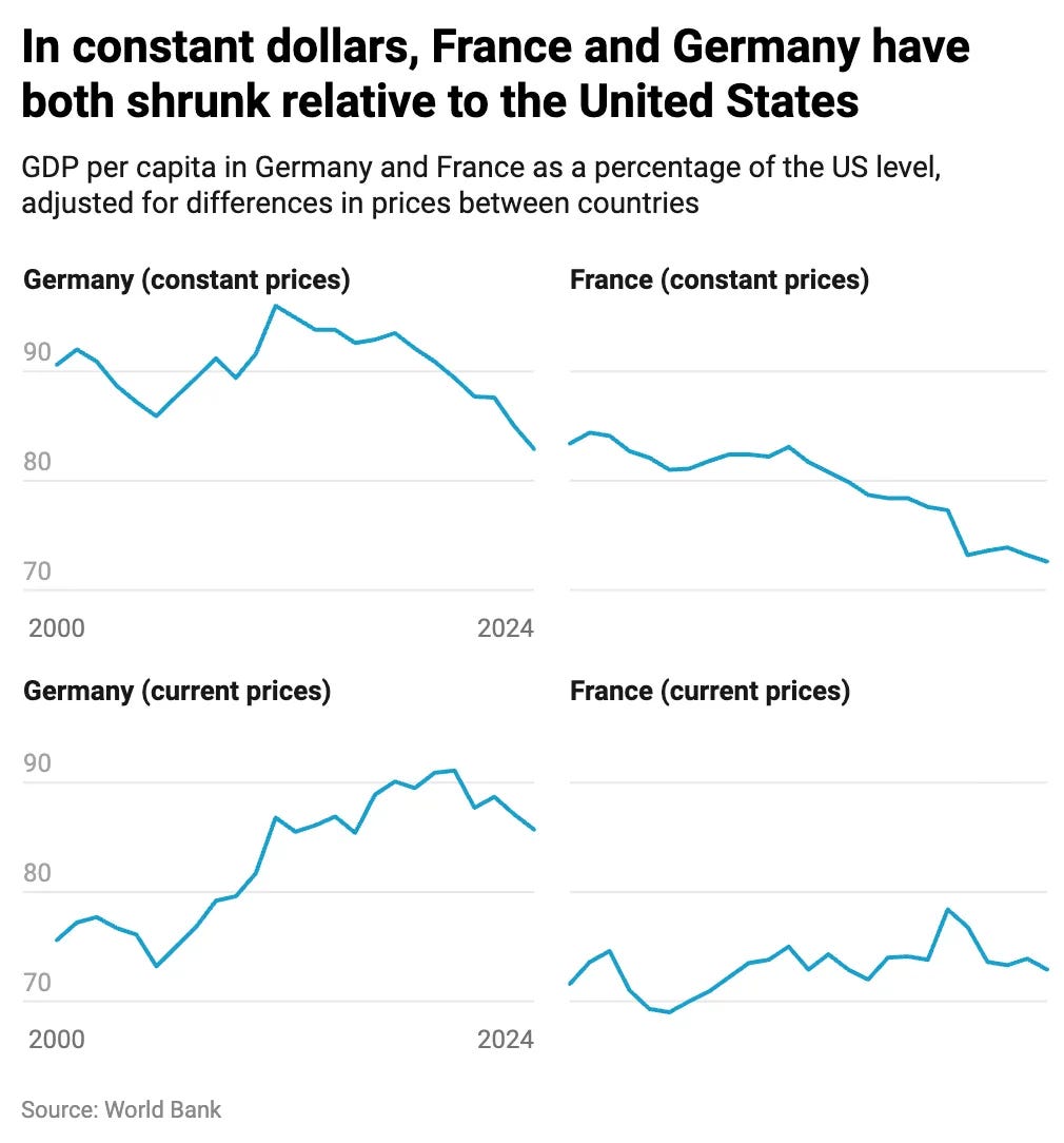
Current and constant prices present a very different picture. While current PPP shows Germany and France largely maintaining or improving their GDP relative to the US, constant PPP shows a clear relative decline. But the truth is that both graphs are useful for answering somewhat different questions.
Current-price measures are useful if we want to compare material living standards between countries (though there are better metrics for this, which I’ll discuss later). Constant-price measures are better suited for analyzing how the productive capacity of different economies evolves over time. Since much of US productivity growth over the last 30 years has been concentrated in the tech sector, which produces internationally tradable goods and services, the resulting price declines benefit consumers on both sides of the Atlantic. As a result, faster American productivity growth does not necessarily translate into equally large divergences in material living standards between the US and Western Europe.
What if we use chain-linked PPP measures, like those provided by PWT — rgdpo (output side — for productivity growth) or rgdpe (expenditure side — for standards of living)? Both are arguably better adjusted for simultaneous temporal and international comparisons than previous measures. That’s what economist Javier López Prol did in his blog post on this recent controversy. He used the regional definitions proposed by Garicano — Western and Southern Europe (WSE) and Eastern Europe (EE)1, since they present wildly diverging starting points and trends. He combined on the graph all 3 metrics (current, constant and chained PPP) to compare their trends.
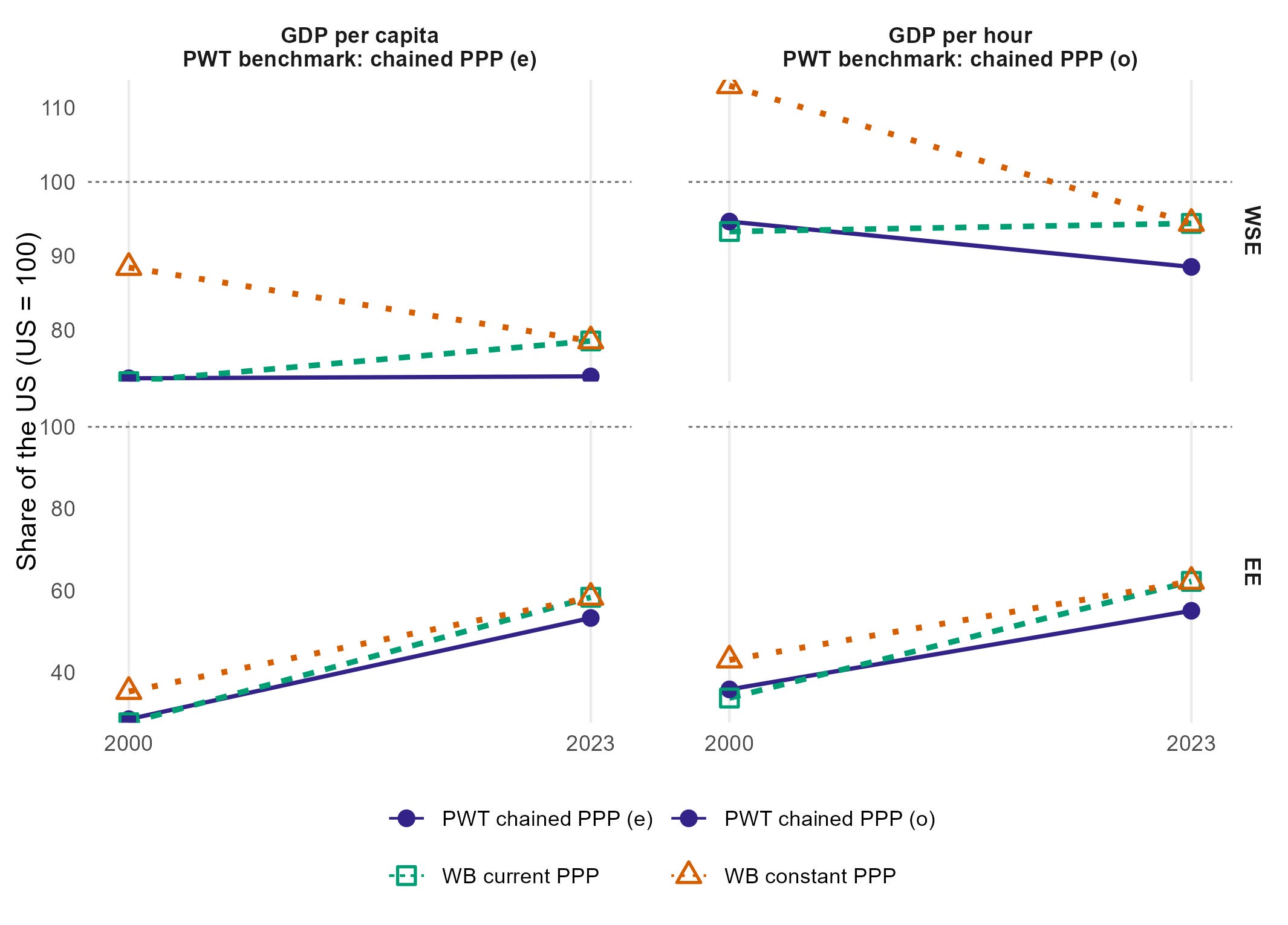
Eastern Europe has strongly converged toward the US in both living standards and productivity. The picture is far more ambiguous for Western and Southern Europe, which is why the choice of metric matters so much. According to the PWT chained PPP rgdpe, living standards in WSE and the US evolved in a broadly similar way. However, at current PPPs WSE converged toward US living standards, while at constant PPPs it diverged.
A similar disagreement appears in productivity measures. According to both PWT rgdpo/h at chained PPPs and constant PPP measures (Garicano’s view), WSE productivity diverged relative to the US (though rgdpo shows much more modest decline). By contrast, at current PPPs productivity largely maintained its relative position (Krugman’s view).
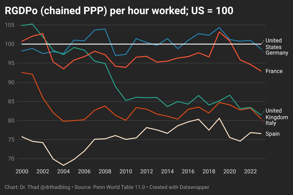
Here’s how rgdpo/h looks like for the biggest 5 WSE economies, as a measure of productivity growth. We can see that Germany, France and Spain remained at similar level relative to the US, whereas UK and Italy noted significant decline.
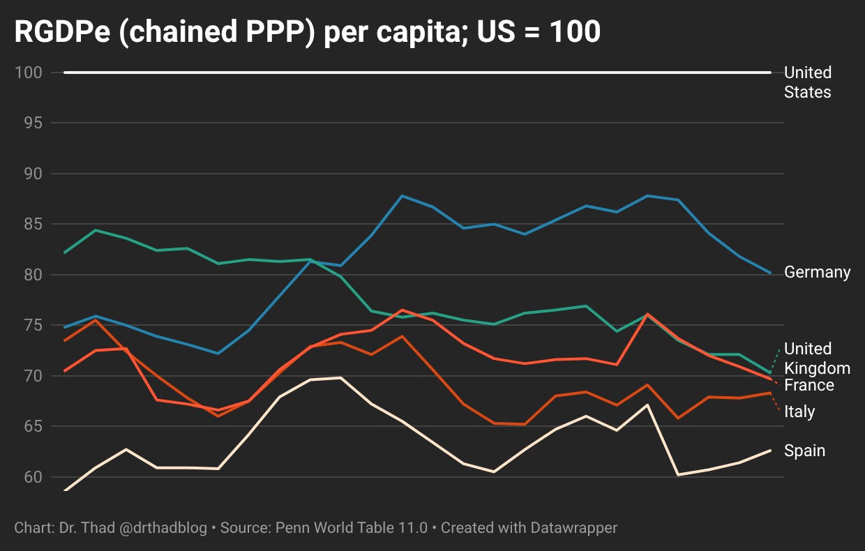
Here is rgdpe, which aims to measure living standards. Germany remains stable or slightly improved relative to US; Spain, Italy and France remained stable and UK declined.
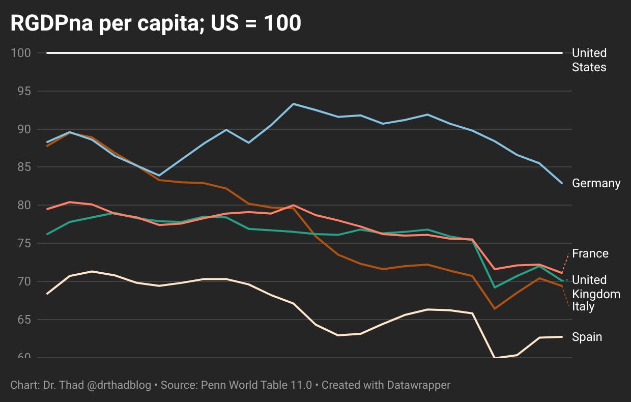
PWT also has rgdpna, which measures real growth according to national accounts, which is a version of constant PPP series. It looks similar to earlier WB constant PPP chart.
And this is how it looks per hour worked.
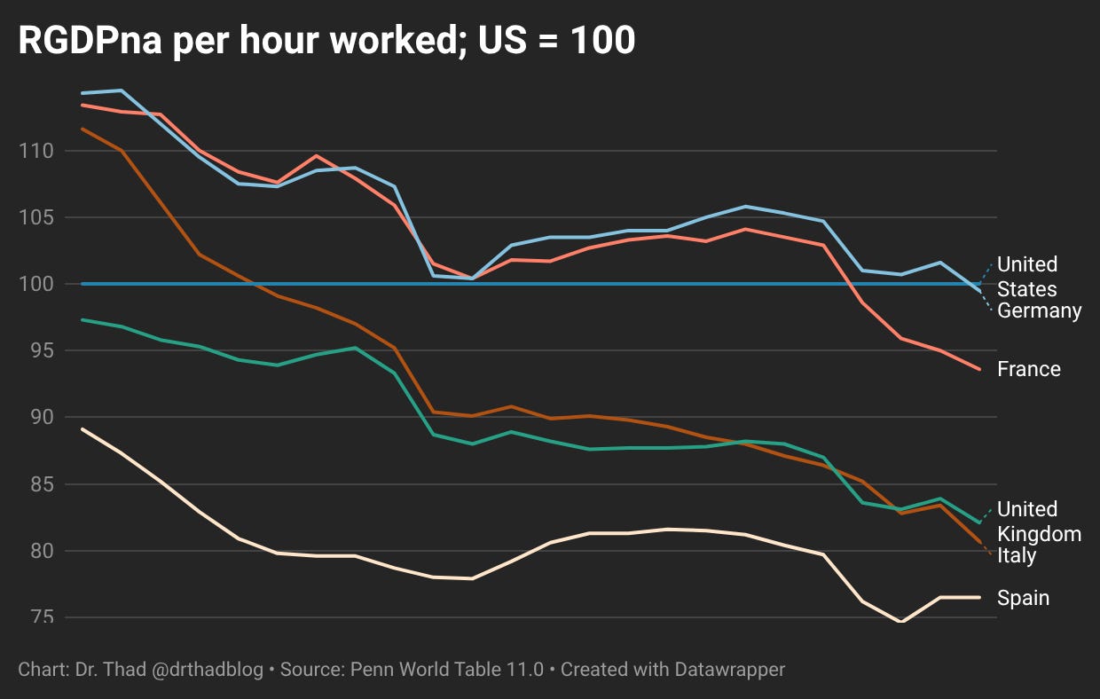
Overall, the picture is roughly this. If we use current PPPs or chained expenditure-side PPPs, Western Europe looks relatively stable compared with the United States, usually somewhere around 60–90% of the US level, depending on the country, year, and exact measure. These metrics are better suited for comparing economic living standards across countries, because they focus more on expenditure, consumption possibilities, and the purchasing power of income.
If we use constant-PPP-style measures, such as the World Bank’s constant international-dollar series or PWT’s rgdpna, we see a more substantial decline in European performance relative to the United States. These measures are better suited for comparing real growth rates, because they preserve national-accounts growth paths more directly. However, they are not perfect for cross-country level comparisons. They depend heavily on the chosen base year or benchmark, and they inherit differences in national statistical methods. Over long periods, small differences in deflators, quality adjustment, sectoral measurement, and statistical practice can compound into large differences.
If we use chained output-side PPP, such as PWT’s rgdpo, the picture is more moderate. Europe shows some relative decline, but the pattern is highly heterogeneous. Germany, for example, holds up much better than Italy, Spain, or the UK. This measure is useful because it is designed for comparing productive capacity across countries and over time, and it avoids some of the problems of a fixed-base constant-PPP series. But it is not flawless either. Because it incorporates changing international price structures, it can be harder to interpret than a simple national-growth-rate series. It may also understate some productivity gains in sectors where prices are falling quickly, especially tradable technology-intensive sectors, which are central to US growth.
So all of these measures are useful, but they answer different questions. The most reasonable combined interpretation is this: European material living standards have not collapsed relative to the United States as measured by per capita GDP. Depending on the metric, country, and year, large Western European economies remain somewhere around 60–90% of the US level. At the same time, there is evidence of weaker European real growth and some relative productivity slippage, especially outside Germany and France. This is especially notable because the US is already the frontier economy in many high-productivity sectors. In theory, we might expect a frontier economy to grow more slowly, since it is usually easier for countries behind the frontier to converge by adopting existing technologies than for the frontier itself to keep pushing forward. The size of Europe’s relative decline is still hard to pin down precisely, because the answer depends on how we treat PPPs, national deflators, changing relative prices, and productivity gains in sectors with rapidly falling prices, particularly technology and other tradable frontier sectors.
GDP per hour can be a misleading measure of productivity
A commonly cited statistic used to argue that Europe, or at least some European countries, are already at or even above the US level of productivity is GDP per hour worked, the standard measure of labor productivity. The logic behind this measure is straightforward: to assess how productive an economy is, we need to compare the amount of output it generates with the amount of input used to produce that output. For labor productivity, the relevant input is not simply the number of workers, but the total amount of work performed, which is usually measured by the number of hours worked in the economy over a given period. If we look at that measure, we see that several European countries are at roughly the US level, and some are slightly above it — excluding countries whose GDP measures are heavily inflated by special factors (Ireland and Luxembourg because of multinational profit-shifting and investment/financial-hub effects; Norway because of resource rents).
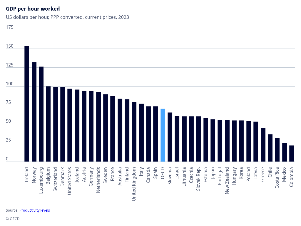
There are some important problems with this metric, however. While GDP per hour worked remains a useful approximation of labor productivity, it should be treated with caution when comparing economies at similar levels of development, because differences in working-time patterns can meaningfully affect the ranking.
The broader issue is that the relationship between time worked and output produced is unlikely to be perfectly linear. At very low levels of work, average output per hour may rise as hours increase, because many forms of production involve fixed costs: opening the workplace, setting up systems, coordinating teams, planning, commuting, managing clients, or maintaining basic operations. Once those fixed costs are spread over more hours, measured output per hour can improve.
But after some point, the relationship can flip. Workers and firms usually prioritize the most important and highest-value tasks first. If working time is limited, available hours are more likely to be concentrated on the most productive activities. If working time expands, the extra hours may still produce real and valuable output, but they are more likely to be spent on lower-priority tasks, administrative work, marginal projects, or work done under fatigue. Output still rises, but not necessarily in proportion to the additional hours worked.
This creates a problem for cross-country comparisons. A country with shorter working hours may appear more productive per hour partly because work is concentrated into the highest-return hours. A country with longer working hours may produce more total output, but because some of those additional hours are lower-return, its average output per hour may look weaker. That does not necessarily mean its underlying productive capacity is lower; it may simply reflect a different point on the hours-output curve.
Suppose country A works 1,000 hours per capita per year and produces 100 units of output per hour. Country B works 1,200 hours. For the first 1,000 hours it also produces 100 units per hour, but for the additional 200 hours it produces only 75 units per hour. Country B will show lower average GDP per hour overall, even though its productive capacity over the first 1,000 hours is identical to country A’s.
In that example, the “productivity bonus from working less” is not a deep technological advantage. It is partly an artifact of using an average-per-hour measure when the hours-output relationship is nonlinear. Countries with fewer hours may mechanically look more productive per hour if they remove the lowest-return hours from the denominator.
There is also a related composition effect. GDP per hour is calculated only over people who are actually employed and the hours they actually work. If one country brings more marginal workers into employment — for example students, older workers, lower-skilled workers, people with weaker labor-market attachment, or workers in lower-productivity service jobs — its average output per hour may be pulled down. Another country may look more productive partly because those same workers are less likely to be employed, whether because of stricter labor-market rules, high hiring costs, insider protections, early-retirement pathways, disability schemes, or other institutional arrangements. In that case, higher measured GDP per hour can partly reflect selection into employment, not simply higher underlying productivity. Therefore, cross-country comparisons of labor productivity should also consider the composition of the workforce: which types of workers are included in employment, which are excluded, and how much this selection affects aggregate statistics.
Both effects (diminishing returns of labor time and workforce composition) seem to at play when it comes to changing productivity dynamics in developed countries. Dew-Becker and Gordon (2008) analyzed the simultaneous European productivity slowdown and employment revival after 1995, asking whether these trends were related. Their answer is broadly yes: within Europe, countries with stronger growth in employment per capita tended to experience weaker growth in output per hour. But this did not mean that Europe simply became worse off. The productivity slowdown was partly offset by faster employment growth, so the gap in output per capita growth between Europe and the United States was much smaller than the gap in labor-productivity growth alone would suggest.
This is directly relevant to how GDP per hour should be interpreted. When employment expands, the additional workers may come disproportionately from groups that were previously marginal to the labor market: the long-term unemployed, lower-skilled workers, women entering or re-entering employment, immigrants, younger workers, or older workers. Their employment can raise total output and income per capita, while lowering measured average output per hour. This is not necessarily a failure of productivity in the deeper sense; it may partly reflect a more inclusive labor market and a different composition of employment.
The working-time channel points in the same direction. Cette, Chang and Konte (2011) test whether productivity per hour declines as working time rises. They find evidence consistent with decreasing returns to working time: hourly productivity is negatively related to working time, and the negative effect appears stronger at longer hours, although they note that the estimates are not always strongly significant. This supports the idea that some of the apparent productivity advantage of shorter-hours economies may reflect the removal of lower-return hours from the equation.
Bourlès and Cette (2006) make the implication even more explicit by distinguishing “observed” productivity from “structural” productivity. They pointed out that some European countries appear close to, or above, the US in observed GDP per hour partly because they have shorter working hours and lower employment rates. When productivity is adjusted for differences in hours worked and employment rates, the apparent European catch-up to the US frontier becomes weaker. In their framing, some of Europe’s high measured productivity is partly a statistical counterpart of lower labor utilization.
These mechanisms are visible in specific episodes. In Germany, the post-Hartz labor-market recovery brought many previously unemployed or lower-attached workers into employment: unemployment fell from 10.3% in 2005 to 4.3% in 2015, while trend productivity growth weakened. This partly reflected a compositional shift: as more initially lower-productivity workers entered employment, average measured output per hour was pulled down, even though total employment, GDP, and material prosperity increased. The COVID shock showed the same mechanism in reverse: in the US, roughly 20 million jobs were lost in the first weeks of the pandemic, disproportionately among low-wage workers and low-wage service sectors. Measured labor productivity then surged by 11.2% annualized in 2020Q2, with labor composition accounting for almost two-thirds of that increase. In one case, adding marginal workers lowered measured productivity; in the other, removing them temporarily raised it. Both examples show why GDP per hour can move for compositional reasons, not only because of changes in underlying technological or organizational efficiency.
Taken together, this literature supports a more cautious interpretation of GDP per hour. The measure is not wrong: it captures real output relative to measured labor input. But it can mix together several different things: genuine technological efficiency, capital intensity, sectoral structure, working-time choices, employment selection, and labor-market institutions. A country can look more productive per hour partly because it employs fewer marginal workers or works fewer low-return hours. Conversely, a country can look less productive per hour because it brings more less-skilled people into employment and produces more total output through additional, lower-average-productivity labor input.
European higher leisure is partially illusory
The common claim is that while the United States may be richer in monetary terms, this advantage is largely offset by Europeans choosing more leisure. There is an important element of truth here. Europeans do, on average, spend less time in paid market work than Americans, and leisure has real welfare value. A society that produces somewhat less income but enjoys more free time is not necessarily worse off.
But the conclusion is often overstated. The first problem is that shorter market working time is not always simply a voluntary choice for more leisure. It can also be the outcome of institutional constraints and incentives: high tax wedges, consumption taxes, social security rules, retirement systems, unemployment benefits, labor-market regulation, union bargaining, mandated vacations, and public-service structures. These arrangements can make market work less attractive, retirement more attractive, or home production more necessary, so the resulting lower hours cannot be read as a clean measure of leisure preference.
Prescott’s classic explanation puts the emphasis on taxes. In his model, higher effective marginal tax rates in Europe reduce the reward to market work and can explain much of the difference in hours worked between the United States and major European economies. The strong version of that argument is controversial, because it requires relatively large labor-supply responses, but the basic mechanism is hard to dismiss: if the state takes a larger share of the marginal return to work, people will generally do less paid market work than they otherwise would.
Alesina, Glaeser and Sacerdote push back against the idea that taxes alone explain the gap. They argue that European labor-market regulation, union bargaining, and “work less, work all” policies played a large role in reducing hours. They also emphasize that Europeans did not always work less than Americans: in the 1960s and early 1970s, European hours were much closer to, and sometimes above, American hours. That makes a simple timeless “European preference for leisure” story weak. Institutions changed, and working-time norms changed with them.
The more plausible view is therefore mixed. Some of Europe’s lower market work reflects genuine preferences and social norms, but those preferences are partly endogenous to institutions. If vacation time is coordinated by law, union contracts, school calendars, and workplace norms, then leisure becomes easier to enjoy collectively: a month off is more valuable if friends, family, and much of society are also off. But this can cut both ways. Coordination may create real welfare gains, yet the same institutional equilibrium can also become suboptimal if high tax wedges, rigid labor rules, inactivity margins, or retirement incentives push labor utilization below the level people would choose under better-designed institutions. So Europe’s lower hours are best understood as a mixture of genuine leisure preference, coordinated social norms, and policy-created constraints — some welfare-enhancing, some potentially welfare-reducing.
A second problem is that some European leisure is partly illusory. Europeans spend less time in paid market work, but they often spend more time in home production: cooking, cleaning, childcare, shopping, household maintenance, and other unpaid tasks that could, in principle, be bought in the market. These activities do not count toward GDP, but they still take time and produce real services. So part of Europe’s lower market work is not pure leisure, but unpaid household labor. At the same time, this cuts slightly in Europe’s favor in GDP comparisons: some small part of the US-Europe GDP gap likely reflects greater marketization of household production in the United States, where restaurant meals, cleaning, childcare, prepared food, and similar services are more often purchased in the market and therefore counted as GDP.
Olovsson’s comparison of Sweden and the United States offers an older but useful illustration of this point: market work per person is roughly 10% higher in the US than in Sweden, but once home production is included, total work differs by only about 1%.
Fang and Yang provide a newer and broader version of the same argument. Using time-use and expenditure data, they find that Europeans work 7–26% less in the market than Americans, but spend 10–37% more time in home production. The combined working time in the market and at home in Europe is lower than that in the United States — but only by 2 percent. Their model suggests that differences in consumption taxes, social security systems, income taxes, and TFP explain a large share of these gaps: higher taxes and lower market productivity make market work and market purchases less attractive, shifting some activity into the household sector instead.
Therefore lower market hours cannot be treated as the same thing as pure leisure. A country with fewer paid hours may genuinely enjoy more free time, but it may also be substituting unpaid household work for paid market services. Europe’s lower market income is partly offset by more non-market time, but some of that time is home production rather than leisure, and some of it reflects institutional incentives rather than unconstrained individual choice. This makes Europe’s lower GDP per capita slightly less damning than a raw income comparison suggests, but it also means that the US income advantage cannot be dismissed simply by saying that Europeans chose leisure.
US is much richer than Western Europe, but not much better on comprehensive living standards
Earlier I discussed living standards using GDP. GDP is generally a good broad indicator of living standards, and across countries it is strongly correlated with many other measures of a “good life.” Richer countries usually have better health outcomes, better infrastructure, higher education levels, more consumer choice, and better public services. But GDP also has well-known limits, especially when we use it as the final measure to compare living standards among already-developed countries.
Let’s start with strictly material living standards, leaving aside for now non-monetary components such as health, leisure, safety, and subjective well-being. The most direct measure of material welfare is people’s ability to consume goods and services. Consumption is, after all, the final purpose of economic activity. GDP, by contrast, measures production: the value of goods and services produced within an economy. Production matters because it gives a society the income and resources needed to consume. But it is still an input into living standards, not the same thing as living standards themselves.
This is why consumption-based measures are often better suited for comparing material living standards. GDP and consumption are strongly related, but they can diverge in important ways. A country can produce a lot, invest a lot, export a lot, or record large corporate profits domestically, without that immediately translating into high current consumption for ordinary residents.
A particularly useful measure is Actual Individual Consumption. It includes not only what households buy directly, but also important services provided to households for free or at reduced prices, such as healthcare, education, and housing services. This matters because countries organize consumption differently. In one country, households may buy more services directly in the market; in another, the same services may be provided through the state. AIC therefore gives a better picture of material living standards than simple household consumption expenditure, especially when comparing welfare states with different public-service models.
This distinction becomes very clear if we look at the richest countries by GDP per capita. Among the top countries in the 2017 ICP data, all of them, aside from the United States, are either investment hubs or resource-rich economies: Luxembourg, Singapore, Ireland, Bermuda, the Cayman Islands, Switzerland, the United Arab Emirates, Norway, Brunei, Hong Kong, and Qatar. These countries can have extremely high GDP per capita, but their actual individual consumption is much lower than their GDP figures would suggest. In other words, they look extraordinarily rich in terms of recorded economic activity that takes place inside their borders, but less extraordinary in terms of what residents actually consume. This is the graph from Deaton and Schreyer (2021) who, among other things, note the distinction between AIC and GDP per capita levels and its relevance for measuring living standards. Data from 2021 look similar.
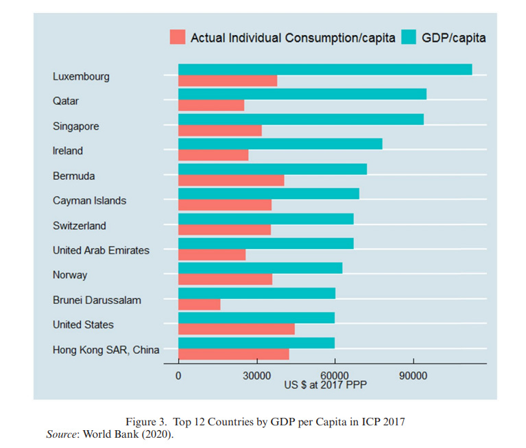
Ireland is the clearest example. In 2015, Irish real GDP rose by 26% in a single year, largely because multinational firms relocated intellectual property assets into Ireland. But Irish households did not suddenly become 26% better off. Household disposable income and national income rose much less. The reason is that GDP counts production located within Ireland, even when the associated profits are linked to multinational accounting structures rather than domestic household purchasing power.
Luxembourg illustrates a different version of the same problem. GDP counts production where it occurs, not where workers live. Around half of Luxembourg’s workforce consists of cross-border commuters from neighboring countries. They help produce Luxembourg’s GDP, but they are not part of Luxembourg’s resident population. This mechanically inflates GDP per resident relative to the income and consumption of residents themselves. Additionally, Luxembourg is also a major financial hub, where a lot of economic activity is derived from international income flows, which adds another level of distortion to its GDP figures.
Resource-rich countries point to another issue. Their GDP can be very high because of oil, gas, or mineral rents. These rents are real, but they do not necessarily represent ordinary household consumption or sustainable productive capacity. GDP is a gross measure, so it does not automatically subtract the depletion of natural resources. A country can therefore look extremely rich in GDP terms while part of that “income” reflects running down natural wealth. That is why many well-managed resource-rich countries try to smooth consumption over time by investing resource revenues and diversifying their economies, either directly or through entities such as sovereign wealth funds.
If we compare the United States with European countries using Actual Individual Consumption, the gap often becomes larger than in GDP-per-capita comparisons. On this measure, the United States is the richest country in the world by a substantial margin — more than 50% above the EU27 average, and roughly 30–60% above large Western European economies, depending on the country and year.
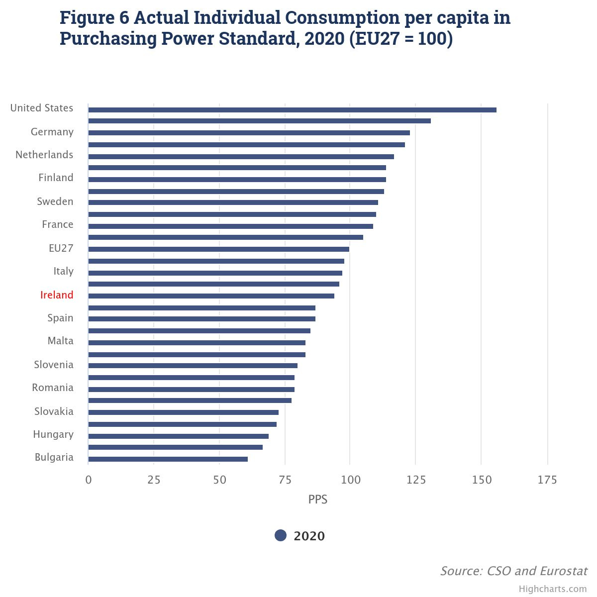
The United States has retained a comfortable lead in Actual Individual Consumption over European countries for a long time, and there does not seem to be much convergence. This is the graph from Noah Smith article, using OECD data.
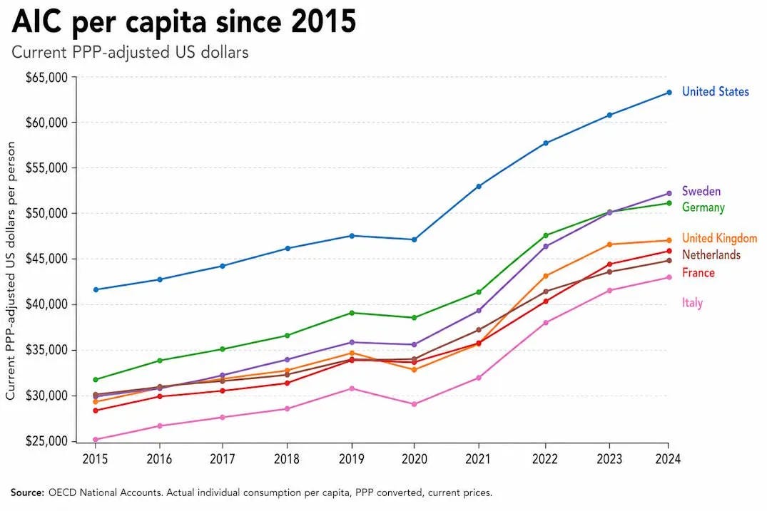
The United States also looks much richer when we use median disposable income rather than GDP per capita. Here’s the 2018-19 chart based on OECD data (chart created by Ryan Radia). Only Luxembourg ranks higher.
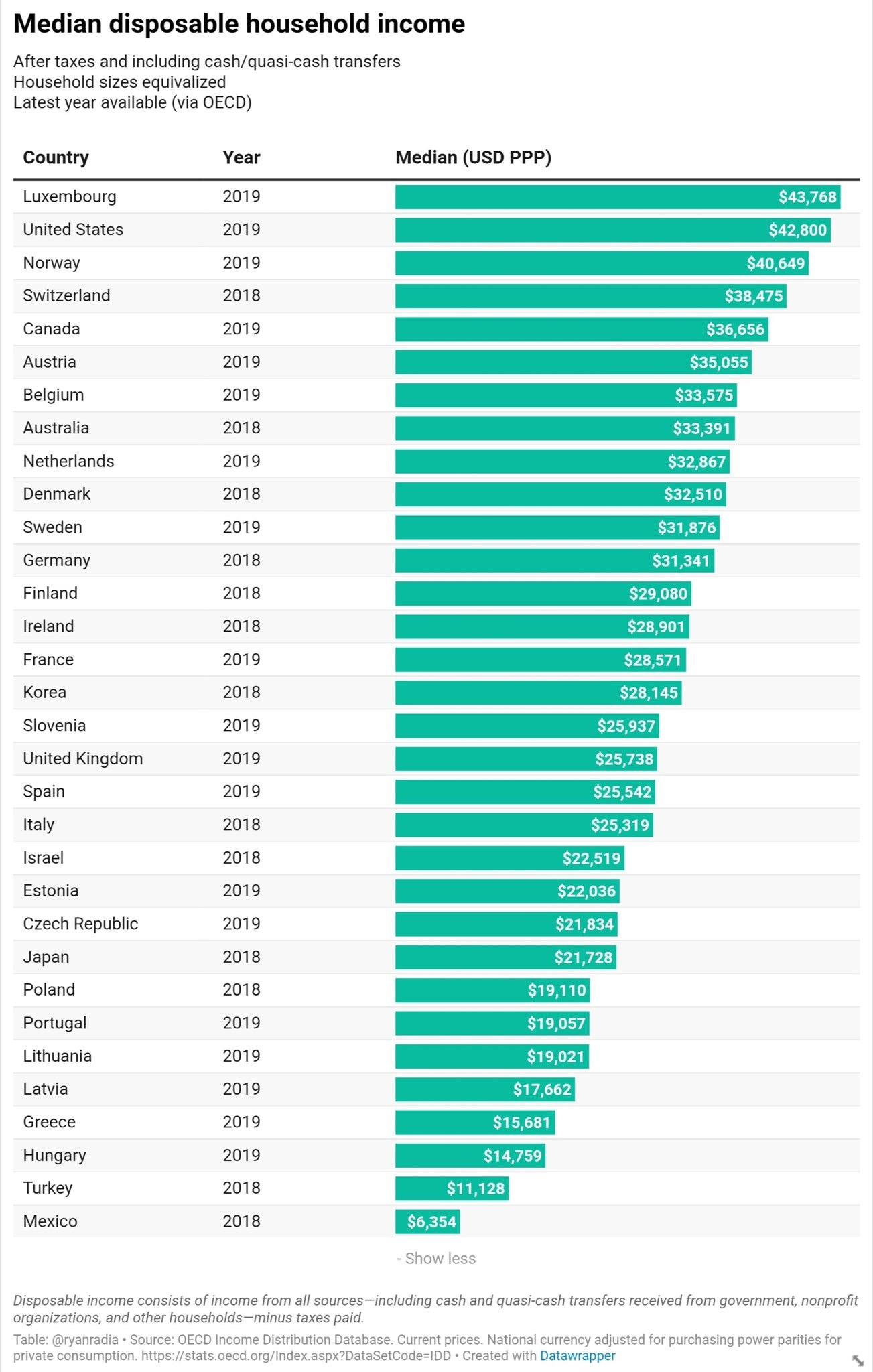
And here is the same data, but from 2021.
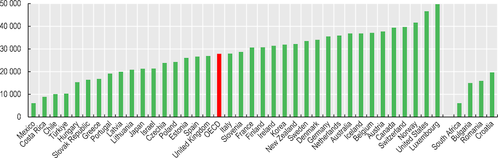
Data from Luxembourg Income Study (LIS) shows similar overall picture.
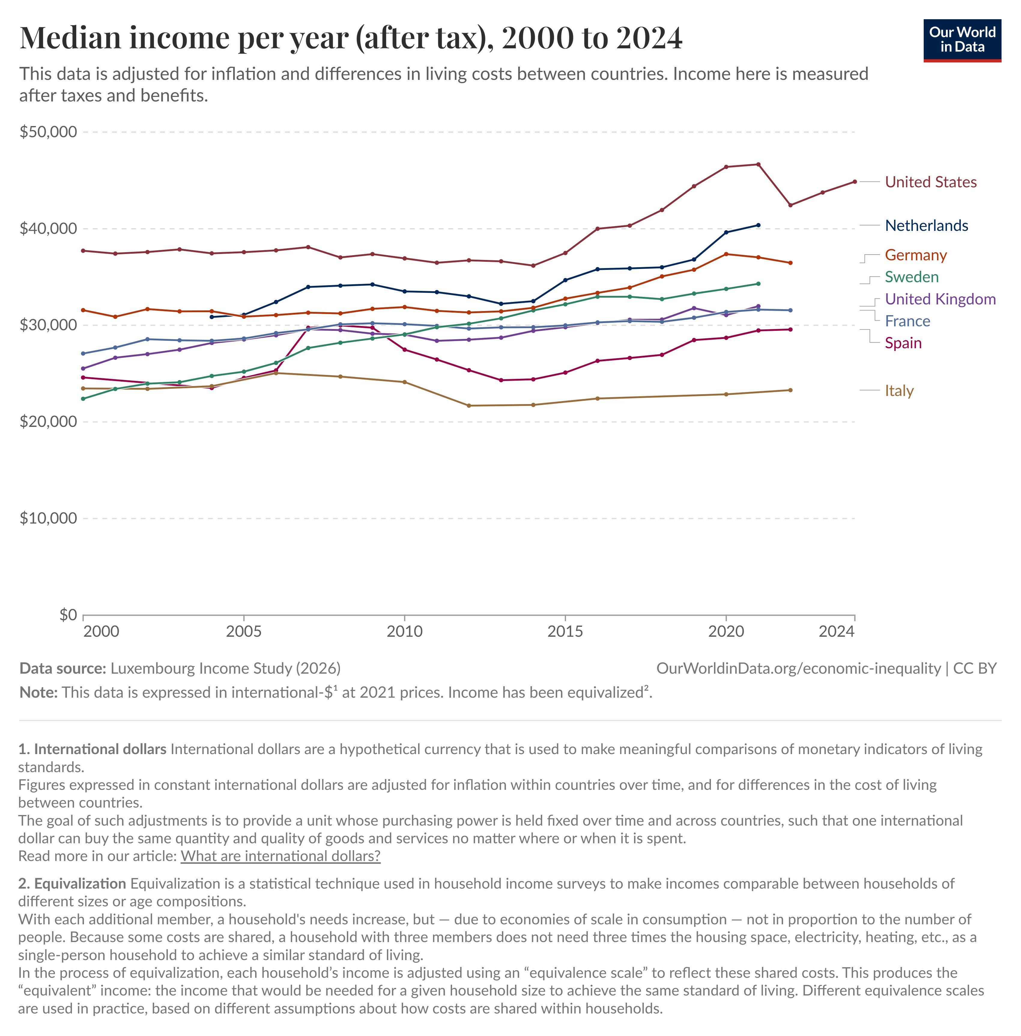
Similar pattern holds across the entire income distribution — since 2019, LIS data show that the United States has had higher median income in 9 out of 10 income deciles compared with the five largest Western European countries. Only France and Germany had slightly higher median income in the bottom decile.
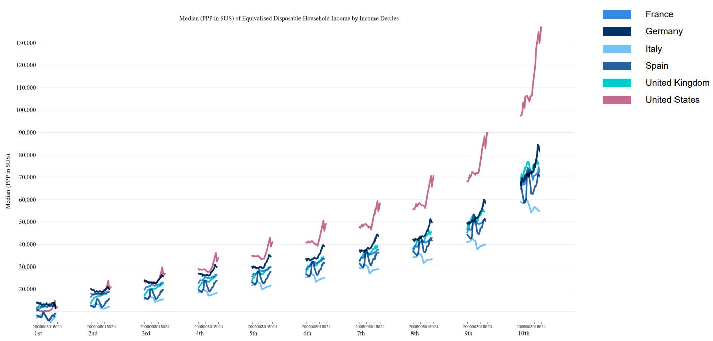
The United States’ lead over Europe only grows if we use more accurate measures of material living standards, such as disposable income or consumption levels. Importantly, these measures already account for government-provided benefits, such as healthcare and education, so this is not the result of omitting the value of Europe’s more expansive welfare states.
Incorporating non-monetary components
The fact that the United States has higher material living standards than Europe is not especially surprising, even if many people underestimate the size of the gap. But there is another familiar point: European countries often perform better on non-monetary aspects of living standards, such as health, safety, work-life balance, and inequality, which also matter for welfare. So if we want to compare American and European living standards properly, we need to incorporate these broader dimensions of well-being, not just income or consumption.
Fortunately, there is a body of economic literature that tries to combine different dimensions of well-being into a more comprehensive welfare metric and use it for cross-country comparisons. These approaches usually start from income or consumption, but then adjust for factors such as leisure, life expectancy, inequality, and other non-monetary dimensions that affect how well people actually live.
One of the first studies in this tradition was Nordhaus and Tobin’s 1972 paper, which introduced a broader measure of economic welfare. Their indicator starts from consumption, but then adds the value of leisure and household production, while subtracting some of the costs and inconveniences associated with urban life. The basic idea was already close to the later “Beyond GDP” agenda — income matters, but it is not the whole of welfare.
Becker, Philipson and Soares (2005) use a utility-based framework to combine income and life expectancy into one measure of “full income.” Their main focus is the evolution of inequality between countries. They show that when gains in longevity are valued together with income growth, cross-country inequality falls much more than standard income measures alone suggest. In other words, rising life expectancy in poorer countries represents a major welfare gain, even when it is not directly visible in GDP.
Boarini, Johansson and d’Ercole (2006) focus on measuring welfare in OECD countries. They construct a measure of full income by valuing leisure using wages and combining it with GDP per capita. They also consider how household income can be adjusted for inequality under different social welfare functions, and separately discuss social indicators such as life expectancy and social capital.
Here I want to focus on two studies. The first is “International Comparisons of Living Standards by Equivalent Incomes”, published by Fleurbaey and Gaulier in 2009. In this paper, the authors develop an index of living standards for international comparisons. Starting from GDP per capita, their measure adjusts for international income flows, labor-force participation, unemployment risk, healthy life expectancy, household demographics, and inequality.
The index is based on the concept of equivalent income, which is meant to account for non-income differences between countries. The authors value non-income factors, such as leisure or health, by estimating how much income people would be willing to give up to obtain a given level of that factor. By adjusting current income by this amount, they arrive at an “equivalent income” measure. This makes it possible to translate different dimensions of welfare into monetary terms and compare living standards across countries more systematically.
They then use this index to compare welfare across 24 OECD countries and compare their results with GDP per capita and the Human Development Index. Compared with the HDI, their measure shows much larger variation among rich countries. This is because the HDI is rescaled using a range that includes both rich and poor countries, which compresses differences between advanced economies. Their equivalent-income index is more sensitive to differences that matter within the rich-country group.
The country ranking also changes. Australia, for example, performs well in the HDI because of strong health and education subindices, but does worse in the equivalent-income measure because of low leisure, high inequality, and national income being significantly below GDP. Sweden also performs worse because of small household size. Finland is negatively affected by both leisure and household-size effects. On the other hand, some countries perform better than in the HDI, such as Denmark, France, Germany, and the Netherlands, mainly because of high leisure.
Using 2004 data, their top ten ranking is:
Luxembourg
Norway
Ireland
Japan
Austria
United States
Switzerland
Netherlands
Iceland
France
With newer data, the ranking would certainly change somewhat — Japan would probably fall, while Germany and some Nordic countries might look better. But it still gives a useful picture of how things looked in the mid-2000s, and more importantly, it shows how much country rankings can change once living standards are adjusted for health, leisure, inequality, unemployment risk, household structure, and cross-border income flows.
The second study is “Beyond GDP? Welfare across Countries and Time” by Charles Jones and Peter Klenow, published in the American Economic Review in 2016. The authors develop a broader welfare measure, expressed in units of consumption-equivalent welfare, and use it to compare both levels and growth of welfare across a diverse set of countries.
Their measure includes four main components: consumption, leisure, mortality, and inequality. They first present the method for a narrower group of countries using detailed microdata, and then extend it more broadly using cross-country datasets. Although their welfare measure is highly correlated with GDP per capita, the deviations are often large and economically meaningful. Western Europe looks much closer to the United States than GDP alone suggests; the Asian Tigers look less fully caught up to the West; and many developing countries fall further behind. Each component matters, but mortality is especially important in explaining the differences.
Jones and Klenow’s method can be illustrated with a simple cross-sectional comparison. Suppose we want to compare the economic welfare of people in the United States and France in a given year. Following their paper, take 2005 as the example.
In 2005, real GDP per capita in France was only about 67% of the US level, while real consumption per capita — a more direct measure of material living standards — was only about 60%. On these measures, it looks as if Americans were economically much better off than the French. But this comparison leaves out other important aspects of welfare. Jones and Klenow focus on three of them: leisure, life expectancy, and inequality. The French take longer vacations, retire earlier, and work fewer hours; they have higher life expectancy at birth — around 80 years in 2005 compared with 77 in the US — and their income and consumption are somewhat more evenly distributed. Once these factors are included, simple comparisons of GDP or consumption per capita overstate the US-French welfare gap.
To quantify these differences in a single metric, Jones and Klenow formalize the following question: if someone had to choose between being a randomly selected person living in the United States — with American consumption, leisure, inequality, and life expectancy — and being a randomly selected person living in France, how much would US consumption have to change to make them indifferent between the two outcomes?
To answer this, they use country-level and micro-level data to translate non-consumption factors into consumption equivalents, using a household-preference model and plausible assumptions about the value of leisure, consumption, mortality risk, and inequality. At the end of this exercise, they estimate that in 2005 a randomly selected French person had welfare equal to about 91.8% of a randomly selected American, despite France’s much lower consumption per capita.
The French example generalizes more broadly to Western Europe, but for poorer countries the pattern often goes in the opposite direction. Because poorer countries tend to have lower life expectancy and higher inequality, their consumption-equivalent welfare is often lower than their income alone would imply. Western Europe moves closer to the United States after welfare adjustments; many poor and middle-income countries move further away.
Overall, the authors’ findings can be summarized as follows:
GDP per capita is an informative indicator of welfare across countries: the correlation between GDP per capita and their consumption-equivalent welfare measure is about 0.98. Nevertheless, there are economically important differences between GDP per capita and consumption-equivalent welfare. Among the 13 countries they study in detail, the median deviation is around 35%, so differences like the one observed in France are fairly common.
Average living standards in Western Europe look much closer to those in the United States once we account for Europe’s longer life expectancy, additional leisure, and lower inequality. In their estimates, Western Europe reaches about 85% of the US level in consumption-equivalent welfare, compared with about 67% in income.
Most developing countries look poorer than income alone suggests, including much of Sub-Saharan Africa, Latin America, South Asia, and China. Lower life expectancy and higher inequality often push their welfare levels further below those of rich countries than GDP per capita comparisons imply.
The authors also report that their results are fairly robust to moderate changes in assumptions. Still, there are important caveats. They use the standard economic assumption that leisure is a “good,” which may not fully capture the psychological and social benefits people can get from work itself. Similarly, inequality is treated as negative because, holding average consumption constant, a person in a highly unequal country faces a greater risk of ending up poor. The framework does not separately include broader “external” effects of inequality — for example, the possibility that people may prefer living in a more equal society regardless of their own personal consumption level.
Again, the data are a bit old, but the general idea still seems to hold. The United States has much higher material living standards, but Western Europe performs better on several non-monetary dimensions of well-being, especially health, leisure, and inequality. Once these factors are taken into account, Western Europe moves substantially closer to the United States, and the overall welfare gap becomes much smaller.
So in my view, comprehensive living standards in Western Europe and the United States are broadly similar. The choice between them depends heavily on subjective preferences — whether one values higher consumption and income more, or places more weight on leisure, safety, longer life expectancy, and other non-monetary aspects of welfare.
Conclusion
There are things Europeans and Americans can learn from each other, and both models have something unique to offer. But it does genuinely seem to be the case that the American economy is unusually good at generating high material living standards, for whatever reason (which would be a good topic for another post).
At the same time, the “Europoor”-related discourse often exaggerates the gap between Europe and America and overstates the stagnation of the European economy. Europe is considerably poorer than the United States in material terms, and there does seem to be some relative decline in economic output. But the gap has not grown as much as many people think. And once we include non-monetary components of welfare, European living standards remain among the best in the world — broadly comparable to those in the United States.
Per JLP: “WSE includes Austria, Belgium, Switzerland, Germany, Denmark, Spain, Finland, France, the United Kingdom, Greece, Iceland, Italy, the Netherlands, Norway, Portugal, and Sweden. Ireland and Luxembourg are excluded because multinational profit shifting and small financial-center effects distort GDP. EE comprises Bulgaria, Czechia, Estonia, Croatia, Hungary, Lithuania, Latvia, Poland, Romania, Slovakia, and Slovenia. All aggregates are constructed by summing GDP, population, and hours first and then dividing.”